Wednesday, 10 August 2016

Infinity House, London


In the thick of Clerkenwell’s variety of styles, scales and uses, Infinity House is an extraordinary family dwelling that has been miraculously carved out from a very constrained site. The detail design solution delivers a haven of privacy, facility and joy. The result is a design led rejuvenation project that substantially extends an 18th century Georgian Townhouse following the demolition of a 20th century industrial workshop that covered the original garden.

The Infinity House, in the historic quarter of Clerkenwell, London is a grade II listed Georgian townhouse, circa. 1716. Planning Permission was granted for renovation, alterations, interventions and extensive additional spaces in 2012.
 
Spaced Out’s design is a dramatic transformation that is completely masked from the Street. The new spaces begin to be revealed once through the front door when you see the entire length of the house. The clients, both internationally acclaimed artists, were very much a part of a collaborative design process established by Spaced Out which focused on light, material and memory. Influenced by Soane, Scarpa, Taut and Kuma we defined our own ‘Clerkenwell’ palette of traditional and contemporary materials which combined create an illusion of time and space to create Infinity House.

The sanctuary and classic section of the Georgian townhouse has been seamlessly linked vertically and horizontally to new spaces. Soft reflections and floating details deliver magical transitions between the old, the new and nature. The structured planting of the sky gardens is visible from all the main spaces. Natural light penetrates at all levels through extensive roof and floor glazing deep into the section as far as the subterranean swimming pool and spa.

Reflections, and subtle reflections of reflections, layer the various spaces of the project combining the historic and the contemporary into one another. This creates a unique and provocative juxtapositions throughout. These reflections widen an elongated site, forming an illusion of infinite space. Lateral views, not provided by a terraced property, are developed with parallel and offset glazed materials applied to the party walls . This is emphasised with an internal and an external courtyard at the junction between the new and the old architectures.

The design stimulates a variety of sensations: texture, smell and acoustic effects are all part of the design palette. Dramatic junctions are formed with quiet details creating highly atmospheric spaces. Infinity unfolds as light pours over, reflects within and is either recycled or absorbed by a variety of surfaces.

There are numerous special moments, great spaces and details for which no amount of words can adequately explain the magic. It is essential to be invited and to make the most of your visit. To take time to appreciate the theatre of the project, that something special; that is London.

Friday, 27 May 2016

North End Road


The brief from our client was to design an extension to a garden flat and first floor flat in a semi-detached property near Golders Green, London, NW11. With the second floor of the property being occupied by another party, a full planning  application was required for the proposal as permitted development rights were not enjoyed; this resulted in tighter design constraints being enforced by the local planning authority. It was these constraints which informed the massing of the two extensions, with the ground floor angling away from the neighbouring properties so as not to infringe upon their light and amenity. A more severe angle was also cut into the first floor apartment, again to ensure there was no loss of light into the neighbouring property. This increasing angled motif ties the new intervention back to the top floor of the property, which retained the original 45 degree cutout. The cascading form of the finished building was informed by the planning regulations stating that a first floor apartment extension could not be as deep as that on the first floor.

The idea of a stepped form was carried through into the pitch of each roof, the garden flat is topped with a contemporary flat roof while the first floor roof is pitched, and the original roof pitch steeper still. The natural topography of the site allowed for a generous height to the internal volume of the ground floor, and the pitched roof was angled in such a way to deliver a more generous head height at first floor. While the form of the extensions was governed by permitted development rights, this also helped merge the contemporary ground floor into the traditional existing top floor form giving these resulting dynamic stepped extensions.

Tuesday, 24 May 2016

Kanada Ya, Panton Street


In the heart of London’s West End close to Piccadilly Circus, at 3 Panton Street, this once dated basement and ground floor french restaurant has been transformed into a unique Japanese ramen restaurant. The transformation is the second Kanada-Ya restaurant in London. Two others are overseas, one in Japan and one on Hong Kong Island. The client brief was to develop themes from their original London restaurant in St Giles, by Haruhito Tomi with Spaced Out to cement the Kanada – Ya brand in London.

As found the space was dark and in need of complete renovation. This provided many design and detail challenges. The result of Spaced Out’s close collaboration with the clients incorporates a skyscape of round ceiling mirrors set at angles to reveal interesting pockets of extended vision for the customers. This feature alone makes the most of the details within the space. High level clerestory mirrors widen and extend the basement space, positioned strategically under the traditional london pavement lenses. The use of round pendant lights, in a variety of sizes and textures, interspersed with the skyscape adds to the dynamics of the space. Reflections of the furniture, occupants and the lighting provides a buzz to the whole composition.
 

The Kanada-Ya brand logo, featuring Mr Kanada-Ya provided the inspiration for the colour pallet, predominantly using black, white and flashes of red as the ‘secret colour’. The original structural brickwork of the space has been beautifully sandblasted and cleaned and combined with natural Douglas Fir timber furniture, injects a natural feel into the more formal colour pallet. The final materials palette creates a comfortable composition. The use of cross laminated douglas fir, by Tilly, is used to form, stools, benches and the round booths. Composed of 3 solid layers of douglas fir, this material has a very graphical as well as natural weave to its cut faces. This is expressed on the furniture as well as the vertically banded screen to the staircase. The douglas fir wood has been treated with a white hard wax oil to provide a silk like finish and added durability.

All the furniture and fittings are designed by Spaced Out and fabricated by an Artist / Maker, the Bamber Brothers of Hackney. The leg profile of the stools reflects the profile of the booth backs , a typical inflection often found in Japanese and other oriental furniture. Whereas, back to back, the booths create an elegant diamond graphic, filled with a flash of the secret colour, red. The variability of form found in chop sticks inspired the staircase screen. Note that each element is paired and that lengths and thicknesses vary based on our research. These quiet but effective references add to the authenticity of the final design language nurtured by Spaced Out.


Friday, 20 May 2016

Drayton Park School, London

Art Studio and Community Space at Drayton Park Primary School


This new Art Studio and Community Space at Drayton Park Primary School provides an inclusive facility for parents, pupils and the wider community.  This proposal provides new teaching spaces, pre and after school facilities, a flexible Community room and new play spaces. The design offers flexibility of use for cross disciplinary knowledge exchange and skills development for all the children of the School. The provision of the Community Room offers parallel activities that can be independently scheduled or integral to the School agenda.

The design seeks to resolve the needs of the School and the wider Community with a building that both visually and spatial represents it’s purpose. The design philosophy includes stages of distillation. Taking care to collate all views raised during the early consultation phases and the more formal design presentations. The Head Teacher and the School Governors have worked tirelessly to open-up ‘best’ channels of communication with the School and the local Community. With resounding success this process has reinforced the concept designs and focused the creation of the scheme that is now being constructed on site.

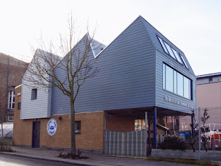
The art studio in part cantilevers over the playground to minimise any loss of playground space. This creates a covered play area and a place for safe play on and adjacent to the lifeboat. The roof form of the art room is derived from attaining the best possible natural ‘flat’ northern light. This helps to minimises energy usage. The symbolic use of a traditional pitched roof house, so often used by children to represent a home, defines the Community Room. The weatherboard cladding links the Architecture to boat houses and the almost entirely lost grain of pre-georgian London.

The requirement for flexibile of use patterns penetrated not only the layout but also the in-use management of the building. As a result the building is independantly heated and secured without compromise to the existing school facilities. It's location as an annex to the main school buildings is purposeful. Access is gained from the playground and/or directly from Arvon Road.

The Lifeboat,  the William Henry & Mary King has become the School's brand symbol since it's arrival after retirement from Bridlington over 20 years ago. To make way for the new building the lifeboats location and support structure  needed to be changed. As a result of workshops with the pupils, staff and parents a decision to lower the boat into a pocket within the playground was approved by the Govenors. It's location close to the new building and related to a covered external area under the Art Studio is a roaring success.

Tuesday, 2 October 2012

Drayton Park School, London


New Art Studio, Community Room and Playspace at Drayton Park Primary School, Arvon Road, London N5
Currently on site and due for completion March 2013


This project provides new teaching spaces, pre and after school facilities, a flexible Community room and new play spaces. The design offers flexibility of use for cross disciplinary knowledge exchange and skills development for all the children of the School.


Art Room Plan (first floor)


The provision of the Community Room offers parallel activities that can be independently scheduled or integral to the School agenda. The potential to extend a broad based knowledge and skills exchange with the local Community is central to the vision of Drayton Park Primary School.
 Arvon road elevation


The art studio in part cantilevers over the playground to minimise any loss of playground space. This creates a covered play area and a place for safe play on and adjacent to the lifeboat. 

Arvon Road Section


The roof form of the art room is derived from attaining the best possible natural ‘flat’ northern light. This helps to minimises energy usage.
Playground Section


The symbolic use of a traditional pitched roof house, so often used by children to represent a home, defines the Community Room.


The design philosophy is an inclusive philosophy that seeks to resolve the needs of the School and the wider Community with a building that both visually and spatial represents it’s purpose. 


The design philosophy includes stages of distillation. Taking care to collate all views raised during the early consultation phases and the more formal design presentations.


The Head Teacher and the School Governors have worked tirelessly to open-up ‘best’ channels of communication with the School and the local Community. With resounding success this process has reinforced the concept designs and focused the creation of the scheme that is now being constructed on site.


Friday, 23 September 2011

Sylvan Glade , Keston Park, London - Grand Designs

First aired on Grand Designs 21st September 2011 at 9pm; the episode was a fascinating insight into the project. Taking you through the demolition of Paul and Penny Denby's 1940's home where they had lived for 19 years, through the complications of planning, right up to the completion of this stunning and serene family home.


The brief to James Engel of Spaced Out Architecture Studios for Paul and Penny's new home focused on inspiration from the transcendental feeling created by the light and space of a woodland clearing. Sylvan Glade is a fluid plan of curves linking open and cellular spaces. The glazed facades emphasise the dynamic relationship with the landscape. The project team facilitated the Denby's wishes to select all their materials and suppliers themselves and their desire to explore new innovative products. The most impressive example of how the project team of James Engel (Design Architect), James Smithers (Projects Contractor) and Vanessa Tarrier (Glass Technology Specialist) worked seamlessly together with Paul and Penny was in the use of Heat Mirror Technology within all the glazed facades.

Sylvan Glade is the first home in the UK to use Heat Mirror Technology on a large scale. This innovative new material allows users to experience all the health and well-being benefits of natural light, whilst minimising heat loss through the glass. The glazing system also prevents the house from overheating in the summer months.

Unusually for a new building that takes risks, throughout construction the whole project team worked harmoniously to allow the design to realise it's full potential - and to deliver to a fixed budget without compromise on the specification of efficient technology.

After initial scepticism from the planning department and the neighbourhood, Sylvan Glade has only admirers, with many positive enquiries for similar projects.

The combination of vision and experience required to design, detail and construct this successful project now means that others have the opportunity to engage with this bespoke collaboration. Through their respective companies; Spaced Out Architecture Studio, Modillion Homes and Cantifix; James, James and Vanessa are set to deliver other luxury projects in the UK and Overseas. (see contact details below)

Check out the Grand Designs episode online at: http://www.channel4.com/programmes/grand-designs/4od for the making of Sylvan Glade! (episode 31 series 7)

Key Facts:
Name: Sylvan Glade - Private Residence
Commissioned by: Paul and Penny Denby
Architect: James Engel - RIBA of Spaced Out Architecture Studio
Main Contractor: James Smithers of Modillion Homes
Glazing Specialist Contractor: Vanessa Tarrier of Cantifix Ltd
Completed: April 2011
Gross Internal Floor Area 343 sq.m ( 3700 sq. ft)
5 Bedrooms plus 1 additional bedroom in the self contained first floor
wing.

Note to Editors: For additional information, images, interviews or sales
enquiries, please use the contact details below.

Architecture - James Engel of SOAS
www.spacedout.co.uk
james@spacedout.co.uk
tel 020 7833 9236

Construction - James Smithers of Modillion Homes.
james@modillionhomes.com
tel 01483 541233

Glazing Technology - Vanessa Tarrier of Cantifix Ltd.
vanessa@cantifix.co.uk tel 020 8203 6203


see also Andie's Blog at
http://andie-scott.blogspot.com

Tuesday, 31 August 2010

Spaced Out Architecture Studio Blog

RIBA Chartered Architects led by James Engel, Spaced Out aspire to provide exemplary ideas and solutions that will survive all elements of resistance.

Our aim is to create enjoyable, practical and uplifting architecture.

Spaced Out Architecture Studio,
Long House,
46 Penton Street,
Islington,
London N1 9QA

tel: +44(0)20 7833 9236
e-mail: info@spacedout.co.uk
web: www.spacedout.co.uk

Spaced Out Architecture Studio is a trading name of Spaced Out Limited
Co.Reg. No. 336685 Members of RIBA and ACID

The Peace Pentagon Competition, New York


339 Lafayette Street,
New York


The design centres around communicating the message of peace and justice within the community. By encouraging visitors to the Peace Pentagon to sign the peace register or relax in the roof top garden we wish to help mobilize the peace movement.

The Peace Register cabin, perched on the lip of the canyon on the side of the building invites visitors to add their thoughts to the register, whose entries will be projected onto the rear wall.

Interactive digital texts and the Dusk-to-Dawn banners (currently illustrated with ‘Peace’ by Luba Lukova) create both a permanent and ever changing display on the street elevations.

The cost of creating this state-of-the-art environmentally sustainable building is projected as being less than 0.063 percent of New York City’s financial commitment to the current Iraq and
Afghanistan wars.

Design and model by Spaced Out, rendering by Clustaspace, banner artwork courtesy of Luba Lukova

Conceptual Design development with Bob Baldwin of Doris Inc.

Monday, 26 July 2010

Nomadic Garden, London


Godson Street, 

Islington


Whilst our director, James Engel, working with Jake Edgerly, are working up a sensitive design for the redevelopment of 1-7 Godson Street, the land has been turned into a sustainable Nomadic Garden by Andie Scott and the students of New River College.  


The site which has been used for the odd market trollies for the last 15+ years and filled with rubbish was purchased collectively by 7 local people to develop into workshops, apartments and housing to help regenerate the chapel market area. These local people have loaned the land to the garden until next year, free of charge.   Since April, over 20 local community volunteers have helped clear the derelict site and get the project up and running.


The garden is in it’s early days but the students have been engaging in making fantastic mural boards for it of an exceptionally high standard.  They are successionally sowing leaf vegetables and herbs to sell to Moro’s restaurant in Exmouth Market who are helping the garden work towards being sustainable.  The project is also starting to recycle local food waste from restaurants and cafes to turn into compost to sell. 


The garden is on wheels so that each year it moves to a new location which is waiting for redevelopment. The idea is that the nomadic garden really is nomadic. Students that become interested in horticulture when they leave college will be assisted with practical training courses and grant funding.


Mayor Mouna Hamitouche came to open the project for the KS4 students and the local community on 18th July.  The day proved to be a fun filled with information, games and gardening for volunteers.  More local residents are becoming involved in the Nomadic Garden and cafes are able to recycle their vegetable waste in the composting system and wormery that has been set up. The development of the site is very important to the regeneration of Chapel Market and Spaced Out are actively involved in seeing the transition sensitively achieved.

Tuesday, 20 July 2010

Green Hub in Tottenham

A energetic, enthusiastic member of our studio, Abigail Stevenson, a recent graduate of CAT (Centre of Alternative Technology), has been busy, outside of Spaced Out, working at The Selby Centre in Tottenham.  Here, she writes about the pioneering ‘Energy Lab’ project and her ongoing involvement with the Tottenham community.  


by Abigail Stevenson


After finishing the Professional Diploma course where I focused on alternative development strategies, I began to put my work to use locally in Tottenham, North London. During a meeting to organize a skill share I discovered a wood recycling scheme called Wood Works Wonders had recently been set up at the Selby Centre (www.selbytrust.co.uk). I later visited the site and found myself at a vibrant community centre that really does live up to its slogan 'many cultures one community'.


I began to work with the Selby Centre to realise its goal as becoming a green hub, by reducing its energy consumption, retrofitting the building and creating a forum for environmental education. Taking the lead from the reuse and recycling philosophy seeded by Wood Works Wonders we are beginning to develop a pilot programme that will take waste generated by the centre and format it into materials that can be used to retrofit the building.


The pilot programme 'Energy Lab' will take a thorough and scientific approach, testing the materials for thermal mass and insulating properties as well as assessing their performance. This is an exciting practical research opportunity, and any willing minds thoughts and comments are most welcome, contact selbywoodworks@aol.com.


http://www.tottenham-today.co.uk/tn/news.cfm?id=24755


Photography by Tim Jones Photography

Tuesday, 22 December 2009

Britton Street, London


Britton Street,
Clerkenwell


This design for a family home and basement studio, to be built from lightweight prefabricated CLT panels, will create a ‘Hidden gem’ in a tight and densely populated site. Surrounded by 4-6 storey buildings the design adds to the artisan community thriving within the historic urban fabric of Clerkenwell, central London.

The massing of this contemporary design solution, which sits between two party walls, has been formed by the need to maximise light penetration, to a site effectively in shadow 85% of the year. Indeed, the design has required careful balancing, in order to maintain privacy for its residents whilst minimising the loss of daylight to the surrounding neighbours.

(Design by Spaced Out, rendering and movie courtesy of Clustaspace)

Out Of Sight, London


Westbourne Road ,
London N7 8AB


Located in Islington, overlooking Paradise Park, this double-pitched mansard roof extension provides a much needed extra storey to an otherwise cramped maisonette. The design solution is an innovative form and structure that does not interfere with the existing terrace features.
Titled "Out of Sight", the composition has made no visual impact / modification to the street scene along Westbourne Road. This was achieved by setting the facade behind the existing front parapet, providing a much needed outside space.

The construction sequence was tuned to enable the family to continue living in the rooms below during the construction period.

The result is that a growing family are now able to stay within their local community with the benefit of more suitable spaces. We believe this is a perfect solution to the growing pains of Families that find themselves otherwise trapped by spatial and planning constraints. Forced to move from sensitive inner city areas to the suburbs.

From the new roof terrace and with glimpses from Paradise Park, the eye-catching roof covering with it’s faceted form is a stunning addition the Terrace. Spaced Out specified this high reflective stainless steel for a specific signature to the building. Playing with this visual effect, its reflective qualities causes a virtual illusion merging the architecture with the sky. Perfect for ‘Out of Sight’.

Shortlisted for AJ Small Projects 2010

King's Cross Gasholder Competition, London


King's Cross,
London

Our proposal was for the main frame of gas holder no 8, to be raised on a giant hand, a heroic gesture to celebrate it’s beauty and magnificence.

In raising the frame from its base, our design creates an amorphic, user friendly new landscape. A place for simple and great events, for culture, art, fashion catwalks, speeches, recitals, performances and much much more......”race you to the little finger” will be heard many times a day.

This extraordinarily refined and purposeful historic structure is reinvented by the armature that supports it. A unique vision for London and King’s Cross, at Britain's gateway to Europe, an overture to a surprising city, a city where anything can happen.

(Conceptual Design development with Bob Baldwin of Doris Inc.)

(Design and model by Spaced Out, rendering courtesy of Clustaspace)